Spring Inspired Palettes
Spring is here, and we couldn’t be more excited for the opportunity to get outside and appreciate this reprieve from life indoors! The blooms are a never ending source of inspiration and although we’re working remotely, the common thread of rich saturation, and vibrancy is appealing to the team as a whole. We wanted to share a few of the Spring colors that are fueling inspiration for new projects in the Studio and beyond. I think you’ll be pleasantly surprised that Spring doesn’t always have to mean soft pastels…read below to see more!
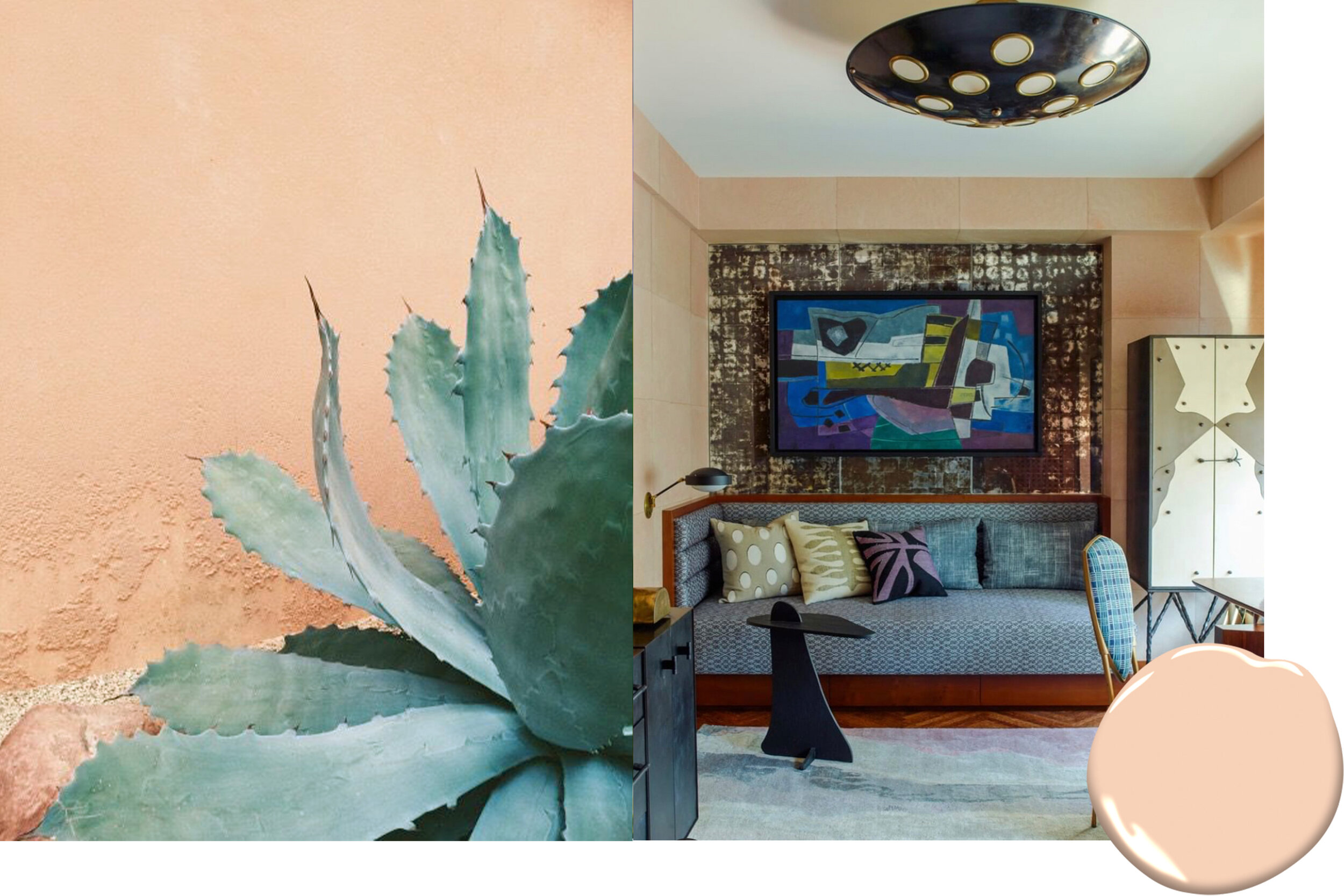
1. Dusty Mauve
Interior design by Pierre Yovanovitch | Benjamin Moore 2174-40
A shade between pale purple and rusty rose. The color is soft, elegant, and nostalgic.
2. Forever Young
Interior design by Kelly Wearstler | Benjamin Moore 066
The approachable hue conveys comfort and ease and looks chic when paired with bold and vibrant colors.
3. Thunder
Interior design by Jamie Bush + Co | Benjamin Moore AF-685
A sophisticated and versatile warm neutral, it compliments and balances a wide range of colors.
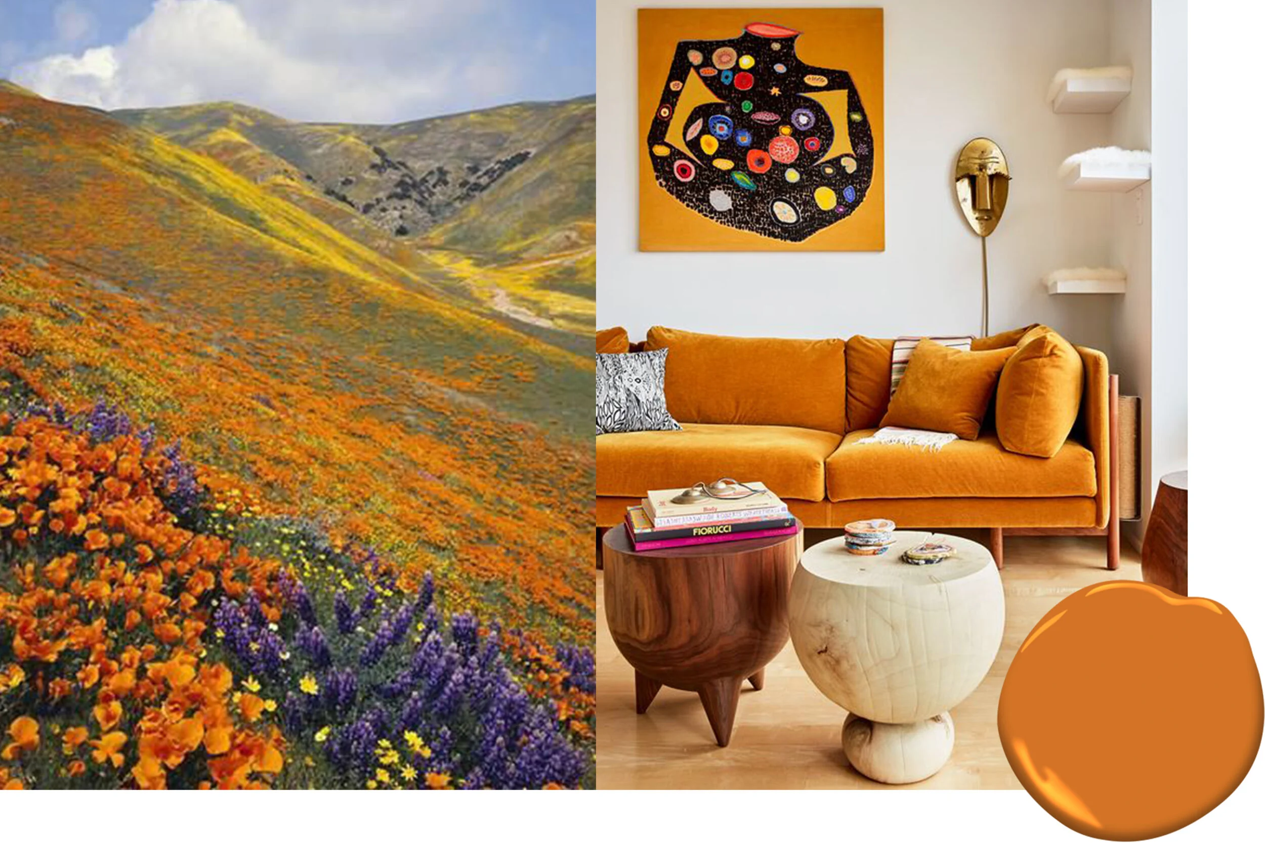
4. 14 Carrots
Interior design by Bower Studios | Benjamin Moore CSP-1110
A color that everyone will notice, the saturated hue brings spaces to life.
5. Hemlock Blue
Interior design by Decus Interiors | Benjamin Moore 719
A shade between dark teal and ice blue, Hemlock blue has a playful yet calming effect.
6. Cactus Flower
Interior design by Jacquie Hudson | Benjamin Moore 1335
Enjoyed for years, Cactus Flower is as timeless as it is fearless.
7. Spectra Blue
Interior design by Kelly Wearstler | Benjamin Moore 2049-50
Cool and refreshing, we’re loving this aqua shade. This is definitely one of the most unexpected yet dominant shades of Spring 2020.
8. Fields of Gold
Interior design by Pierre Yovanovitch | Benjamin Moore 203
A rich, earthy gold tone that provides major impact. Just a touch of this lively color elevates a scheme to new heights.


